
Showing the product without it looking like a screenshot
The app screen among watercolour washes. A product piece that does not read as a screenshot pasted onto a background.
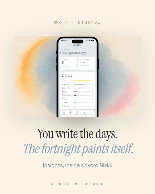
The trouble with showing a product is that a screenshot on a flat colour reads as an ad and gets scrolled past. Here the screen sits mounted among the washes, on the same paper and in the same colours as the rest of the brand, so the piece reads as a piece first and as a product second.
It is also the hardest one to keep on brand, because it carries an image that was not designed for this: the screen has colours of its own. What holds it together is the crop and the paper, which do come from the kit.